Until now, our News 1 child template has only been assigned to our Module Demo page. This allowed us to confirm the appearance of new module rows on our Module Demo page without affecting the rest of our website. Now that we have our module rows, it is time to assign our News 1 child template to our entire website in order to customize the layout of our News Home Page articles. In this article, we will review essential steps in converting our website from the Helix Template to the Cassiopeia based News 1 child template.
Step #1 Convert our Community News website to the News 1 template
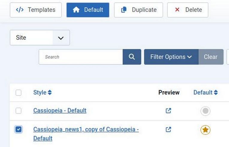
From the Home Dashboard, click Template, Styles. Then select the News 1 template version that includes “Copy of Cassiopeia”. Then click Default.
Step #2 Create a News1 Header Module
Visit the front end. Unfortunately the Header module we used for our Helix template no longer displays because our News 1 template is using different module position names than our Helix template. In fact, the only thing that does display on our Home page are articles that have been assigned as Featured articles. These display in the Joomla Component area.
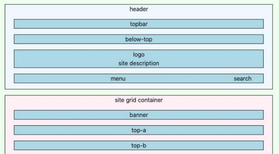
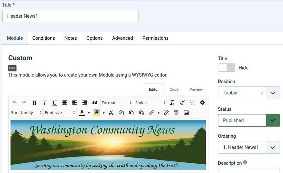
To fix the header module problem, first go to Content Modules. Click New to create a new Custom Module. Name it Header News 1 and assign it to the Top Bar position.
The Top Bar position is one of four module rows that is included in the Cassiopeia Header area of our website. Importantly, it is outside of our Site Grid Container meaning that it is not affected by settings we apply to our site grid.
Hide the title and publish the module. Then click on the JCE Image Manager button to insert our News Header image we created earlier. Here is what our Module workspace looks like:
Click on Conditions and add a condition to display the News 1 header image on all pages. Then click Save and Close.
Step #3 Assign the Main Menu Module to the News 1 menu position
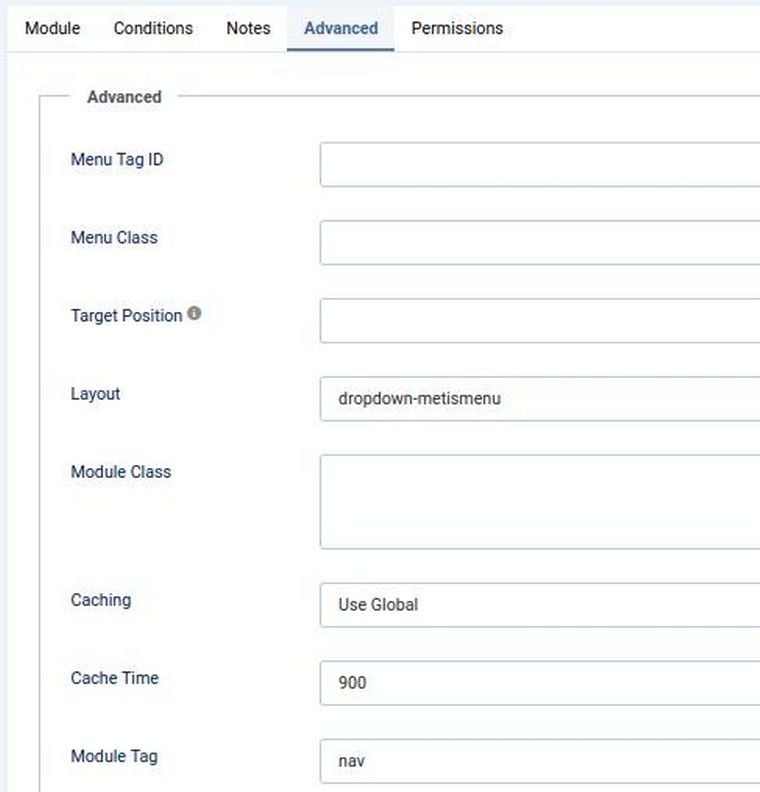
In Content, Site Modules, click on the Main Menu module to edit it. In the Position box, change the position to the News 1 menu module position and publish the main menu on all pages. Then click the Advanced Tab and change the Layout to dropdown-metismenu. In addition, change the Module Tag to nav. Then click Save and Close.
Step #4 Hide the Cassiopeia Banner
Go to Templates, Styles and click the News 1 default template to edit it. Click the Advanced tab and change Brand from Yes to No. Then scroll down the screen and change Menu Hover from No to Yes. Menu Hover is an important feature added by Linelab that does not exist on the normal Cassiopeia Parent template.
Also click on the Styles tab to set background colors for each module row. Note that even our new module rows have background color settings.
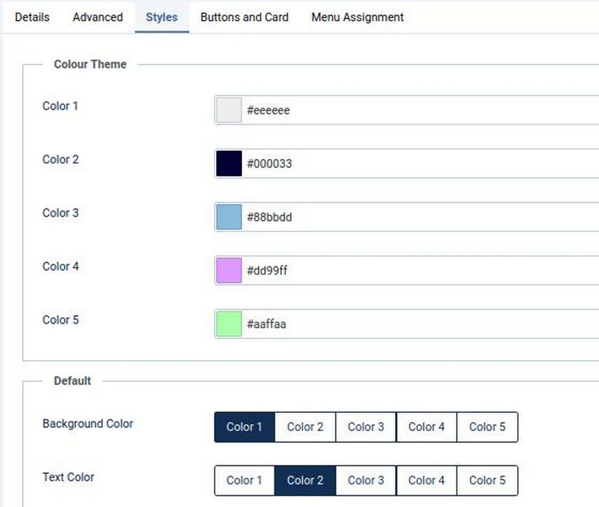
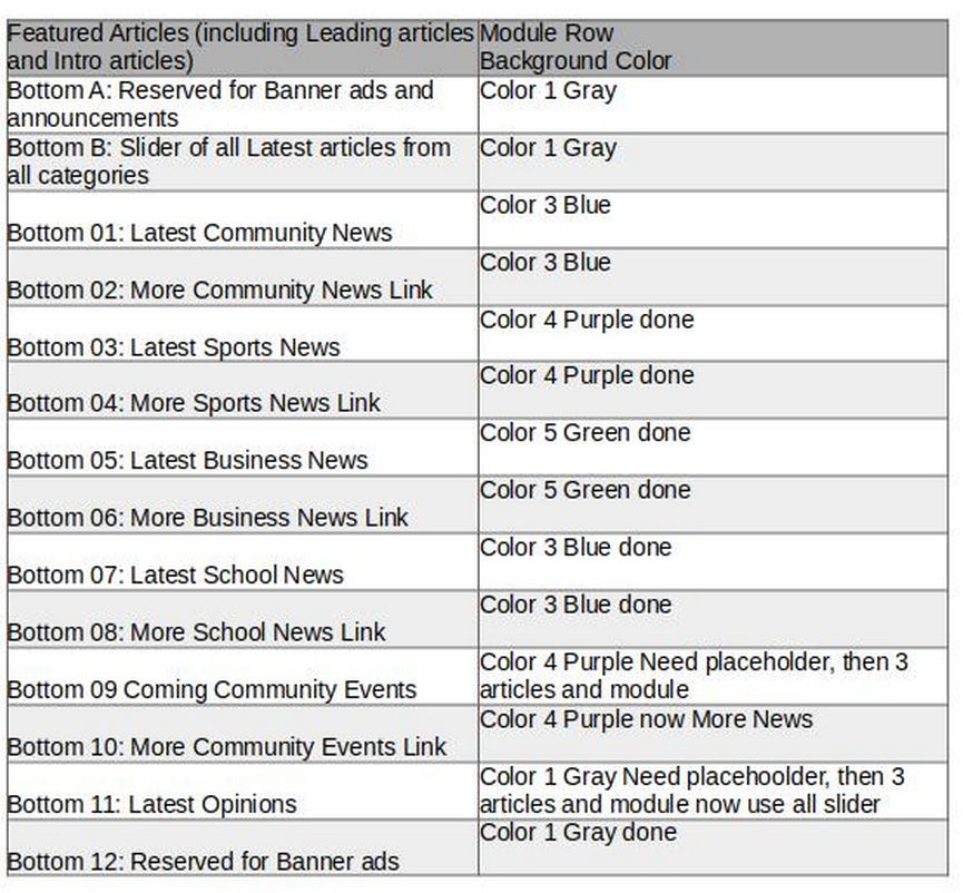
We will use Bottom Rows 1 through 10 to display our News Topic Categories. Each category takes two rows. The first row is for the Latest News articles in that category. The second row is to display a link to More News articles in that topic category. Both rows should have the same background color. We will use Color 3 for bottom rows 01 and 02 background colors. These are the Community News rows:
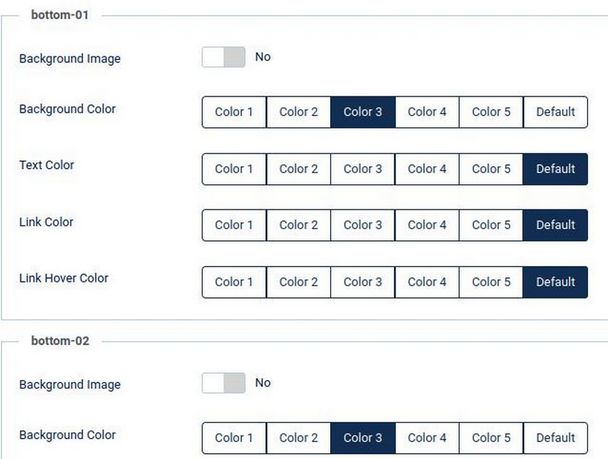
Then Color 4 for the Sports News Rows 3 and 4. Then Color 5 for the Business News Rows 5 and 6.
Below is a Table of all of our Topic Rows and Background colors:
Then click Save and Close and view the result:

Hover over each of the top level menu items to confirm that the second level menu items appear without the need to click on the top level items. To change the width and the background color of our drop down menu items, add the following to our News 1 user.css file:
.header.mhover .metismenu.mod-menu li:hover > ul
{min-width: 250px; background-color: #AADDFF; font-size: 16px; font-weight: bold; }
Step #5 Improve the Home Page Featured Articles Layout
In a previous article, we explained that with the Helix template, we could achieve a one column Float Left Leading Article Layout:
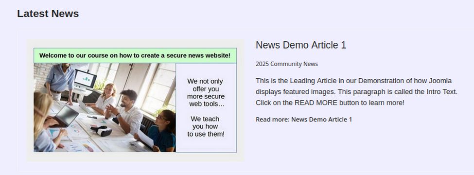
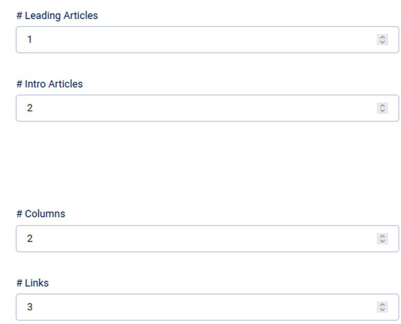
But we could not add any Intro articles. Now that we are using a child of the Casseopeia template, we are able to have both our one column, float left Leading articles layout and a two or three column, two or three article Intro Article layout. Go to the Menus, Main Menu and click on the Home Menu item to edit it. Then click the Blog Layout tab. Set it for 1 Leading article and 2 Intro articles with two columns for the Intro articles:
Then view the result in the front end:
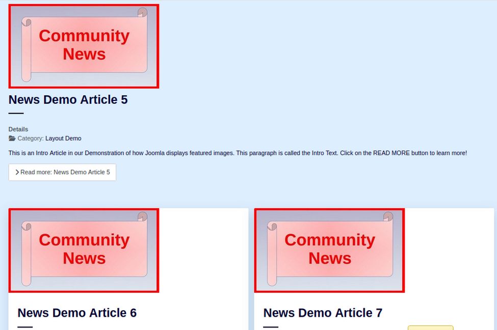
There is a lot of wasted space to the right of the Leading article. Use the following class for the leading article: boxed image-left
Here is the result:
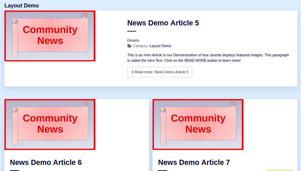
The leading article is better but there is still a lot of wasted space in the Intro articles to the right of each image. Add this class to the Intro Articles:
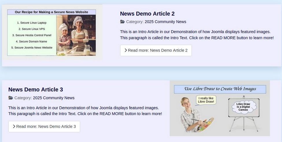
boxed image-right image-alternate

There is still a lot of wasted space below the Intro Images. Change the Intro articles to 1 column with alternating images to the right and left:
Here is what 3 articles in three columns looks like with no article classes added:
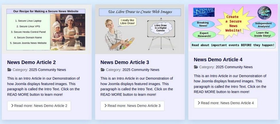
Step #6 Fix the Leading article image display problem
There is still a problem with the Leading article image not displaying correctly:

The problem is that Cassiopeia CSS sets the text to take up 60% of the width and the image to only take up 40% of the width. We want just the opposite – for the image to take 60% and the article text to take 40%. We also want to change the background from white to light blue. These problems are solved by adding the following to our News 1 user.css file:
.image-left .blog-item .item-image {flex-grow: 1;flex-shrink: 0;flex-basis: 60%;}
.image-left .blog-item .item-content {flex-grow: 1; flex-shrink: 0; flex-basis: 40%;}
.boxed .blog-item {background-color: #eeeeff;}
.blog-items[class*=" columns-"] > div {background-color: #eeeeff;}
Here is the result:
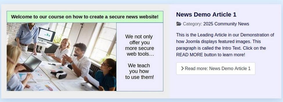
Step #7 Hide Pagination, Details and Parent Category
We want to eliminate anything on the Home page that will confuse readers with unclear navigation buttons or distract them from reading the articles they are most interested in. We will therefore hide the Pagination from the Featured articles area, and hide the word “Details” and hide the Parent categories from displaying – leaving only the child categories that our articles are actually in. We will also reduce the font size of our category titles.
Hide pagination
When you have a lot of articles in a given category, a Pagination row is displayed below the Lead and Intro articles. We really just want to have a few Featured articles at any given time. But we also want to hide the box in case some past Featured articles have not been removed from the Featured area. In the Main Menu, click on the Home menu item to edit it. Then in the Blog Layout tab, scroll to the bottom of the page and Hide Pagination and Pagination Summary:

Hide the word Details
The word Details appears below the title and above the description. The problem is that it takes up vertical space. All we want is the child category to appear below the title and above the description. To hide the word Details, add this line to our News 1 user.css file:
dt { display:none !important; }
Reduce the Category Blog Heading Font size
Add this line to our News 1 user.css file:
h2 {font-size: 22px; color: #000033;}
Hide intro article details parent category
There are three places where options are set in Joomla. Global Options are set in the Content Articles screen by clicking on Options. You can modify the Global Options for each article by click on the Options tab in the Article Edit screen. However, both of these settings take a lower priority to Options set in the Menu Item Edit screen. Therefore, the best way to make sure the settings you want are applied is to edit the settings for each Menu Item. Here we want to hide the Parent category on the Home Menu item. So click on the Home menu item to edit it. Then click on the Options tab. We will set the Parent Category to Hide and set several other options to hide on this page but they will still appear on the Full Article page as long as they are set to appear in our Global Options settings:
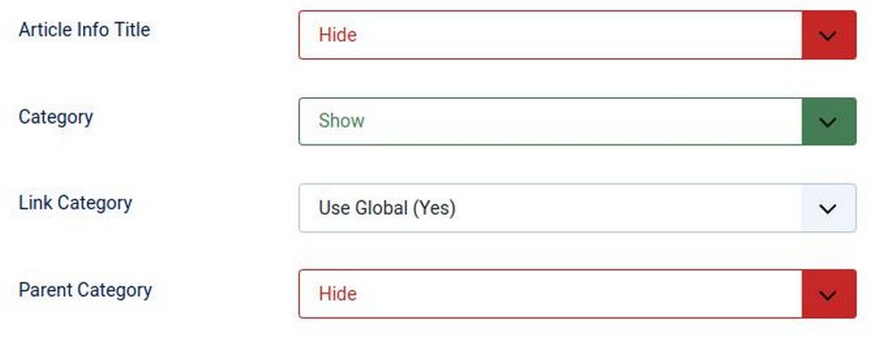
Add the following to user.css to change the details area on our Full Article pages from a vertical to a horizontal display:
.article-info dd {padding: 0; display: inline-block; margin-right: 1em;}
This will change the area below the title from this:
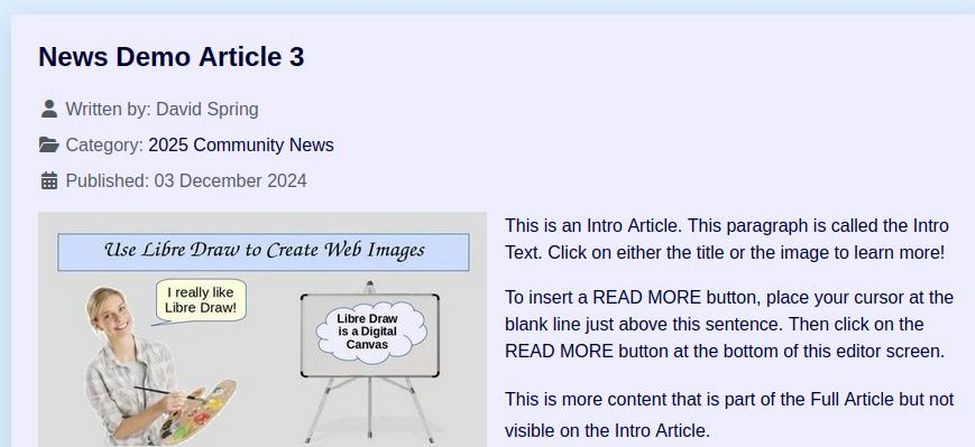
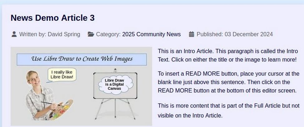
to this:
Step 8: Change the Cassiopeia template Standard Theme
Click on Templates, Styles, News Template, Advanced tab and you will see that the Cassiopeia template comes with two Color Themes. The Standard Theme is purple. The Alternative Theme is wine-red. If you want to change the standard theme to a different theme, you can add the following to your user.css file:
:root {
/* Make entire page background light blue. */
--body-bg: #eeeeff;
/* Make Text Black */
--body-color: #000000;
/* Adjust Cassiopeia Primary Color Scheme */
--cassiopeia-color-primary: #aaaacc;
--cassiopeia-color-link: #000055;
--cassiopeia-color-hover: #000099;
}
Step 9: Change all article intro and full images to 400 pixels
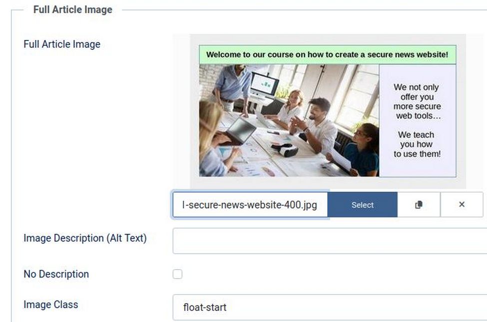
The Cassiopeia template comes with the ability to float the Intro and Full article images to the left of the article description. This not only saves space, but improves readability. Click on each article to edit it. Then click on the Images and Links tab. Then in the Intro Image Image Class box, type float-start. Also type float-start in the Full Article Image Image class. Because the images will now float left, we can reduce the width of all of our full article images to 400 pixels as shown below:
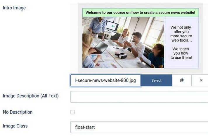
We should also set all of our Intro article images to 400 pixels – with the exception of any articles we will use as Leading articles. Those should have an Intro Image set for 800 pixels as shown below so that they display correctly in our Leading article images box on our Home page:
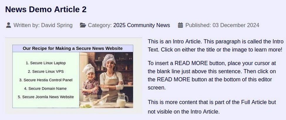
Here is what a 400 pixel full article image looks like on a Full Article page:
Step 10 Move all of our existing Latest News modules from Helix to News 1 Module Positions
At the end of article 4.3, we used a special Joomla module called “Articles” to create several Latest News Topic Modules. These modules are listed in our Modules Table and include Latest Community News, Latest Sports News, Latest School News, Latest Business News and Coming Community Events. All of these News Topic category blogs are set to display in Helix module positions on our Home page. To change them to News 1 template module positions, go to Content, Site Modules and click on each one to change its module position.
Then view the result on our Home page:
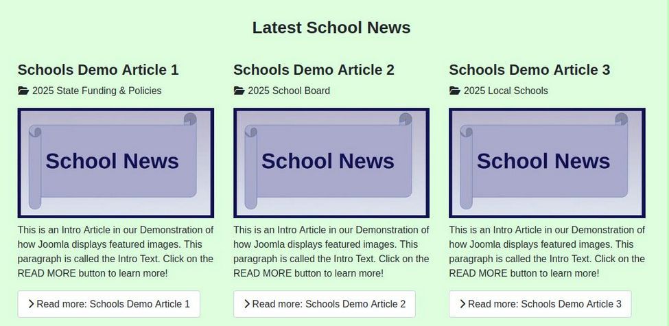
Step 11 Hide the READ MORE Links
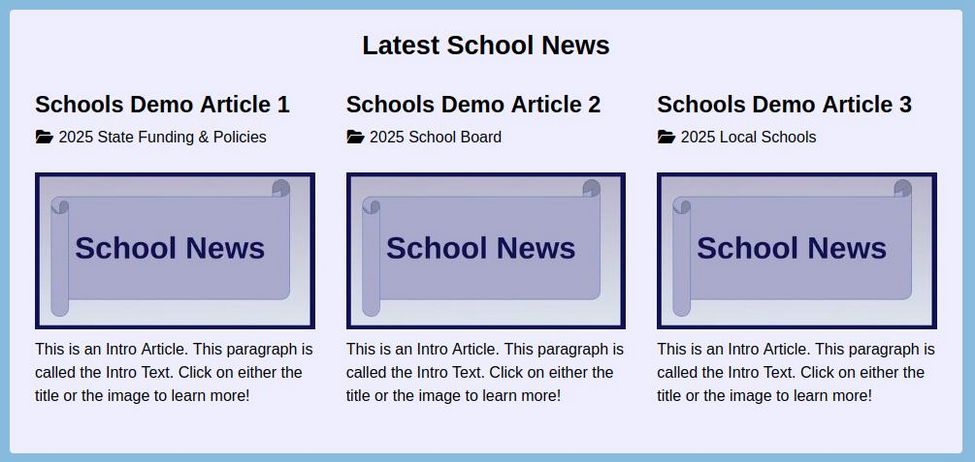
Because most people know that they can click on either the image or the title to go to the actual article page, most News websites have opted to hide the READ MORE buttons. This reduces the amount of vertical space taken up by each article. To hide the READ MORE buttons globally for all articles, go to Content, Articles and click OPTIONS in the upper right corner. Then in the Articles tab, change the READ MORE link from Show to Hide. Then click Save and Close. In addition, click on each Demo article and change the text from “Click on the READ MORE button to learn more!” to “Click on either the title or the image to learn more!” Here is what the Latest School News topic row now looks like on our Home page:
Step 12 Add Category Link Module Rows below each of our Topic Module Rows
Modules in different module positions in the Cassiopeia template get a “module position” class name in addition to the “card” class. For example, if you want to change the appearance of all modules in the bottom-b module position, then use the combination class: .bottomb.card. We will use this combination class to define background colors and font colors for each of our News Topic module rows displayed on the Home page of our News website and match the colors with Colors 3, 4 and 5 on our News Template Styles tab. Here is what we add to the end of our user.css file:
.bottom01.card .bottom02.card { background: #88bbdd; color: #000044;}
.bottom03.card .bottom04.card { background: #dd99ff; color: #440044;}
.bottom05.card .bottom06.card { background: #aaffaa; color: #004400;}
.bottom07.card .bottom08.card { background: #88bbdd; color: #000044;}
.bottom09.card .bottom10.card { background: #dd99ff; color: #440044;}
.bottom11.card .bottom12.card { background: #eeeeee; color: #004400;}
Next go to Content, Site Modules and click New. Then click the Custom module type and name it More School News. Hide the title and assign it to the bottom-08 module position. In the JCE editor workspace, copy paste:
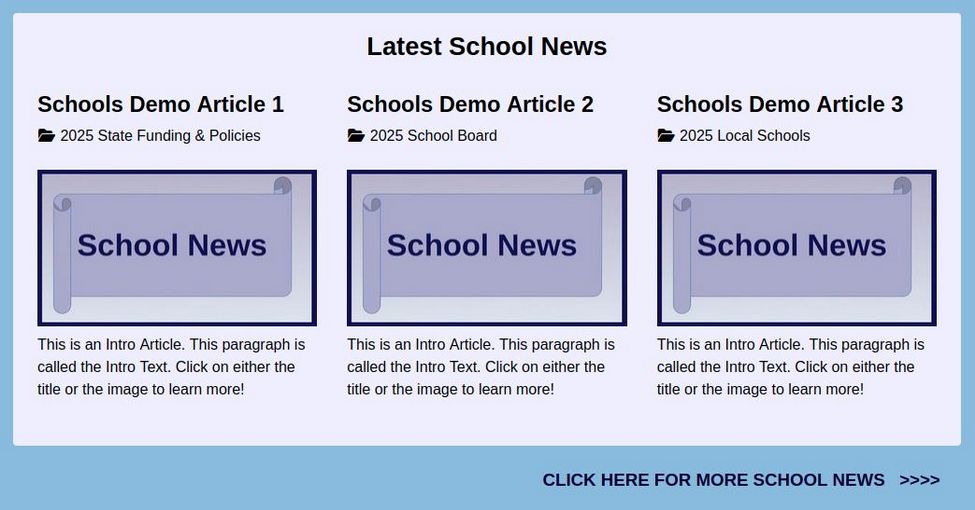
CLICK HERE FOR MORE SCHOOL NEWS >>>>
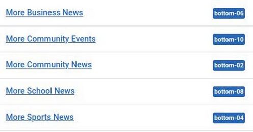
Select the text. Then click on the Link button to add a link to the School News menu item. Save the module. Then click the Conditions tab and click the Home page. Then save and close the Conditions screen and save and close the module. Make copies of the module to create Topic Link modules for More Community News, More Sports News, More Business News and Coming Community Events. Here is our Module table when we are done:
Here is what the Topic Category link module row looks like below our Topic Category module row:
Step 13 Add a Leading article slideshow to the top of our Home Page
There are two problems with the current leading article display. The biggest is that only one or two leading articles can be placed at the top of our Home page at any given time. The second is that the display is static. It would be better if we can place a slideshow at the top of our Home page that can then rotate between several articles. We previously have added an ALL NEWS slider which is displayed near the bottom of the Home page and is rotating articles three at a time from several news categories:
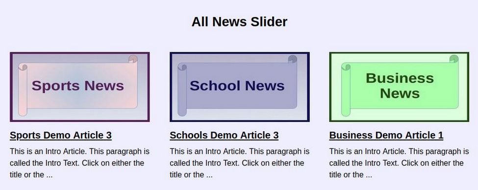
This slider is made with an excellent Joomla extension called JT Content Slider. We will make a new version of this slider and place it at the top of our Home page above the Main Component article. If we like the way it looks, we can use it to replace our single leading article area just by setting our Leading articles box to 0 articles.
Go to Content, Site Modules and click New. Then click on the JT Content Slider. For Title, type Breaking News. For position, select Top C. Then click Save. Then click on the Conditions tab and set it to only appear on our Home page. Then click on the General Settings tab. For Source Category, we can later create a category for articles to appear in this slideshow called Breaking News. For now, we will just use our four news categories. Change articles to display to four. Leave Featured articles to show. Set the width for 900, number of columns to one and number of rows to one. Show the Dots and Navigation arrows. Set Slide by to 4. Change Auto Transition to Yes. Reduce the Dots bottom position to 0 px. Increase Pause to 6000 (6 seconds). Set the right and left module padding to 10px.
Then click the Article Properties tab and hide the author and date. Increase the Title Limit to 25 words and increase the Word Limit to 600 characters. Hide the Show More category links. Then click on the Thumbnail tab and increase the Thumbnail width to 600 and change Keep Aspect Ratio to Yes. Change link image to Yes. Click the Mobile settings tab and change the columns for small screens to 1. Then click Save and close and view the result.
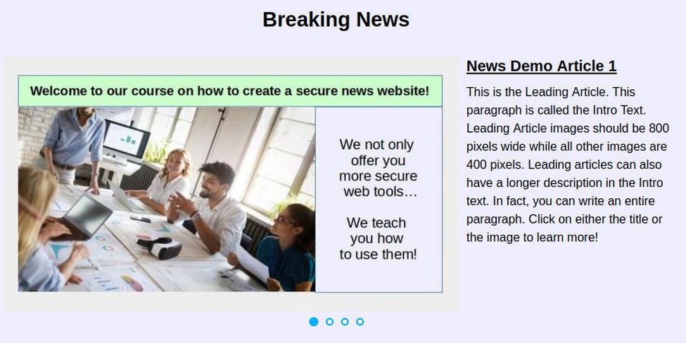
Add the following to the user.css file to improve the appearance:
.container-top-c > .card:last-child {
padding: 20px 20px 0px 20px; margin: 0px;}
.jt-cs .jt-introtext { font-size: 20px;}
.jt-cs .jt-imagecover img { margin-right: 20px;}
Step 14 Add a Bottom Menu
It is common to create a header at the bottom of your Home Page website. Layout with links to various pages related to your Community News such as an About Us page or an Advertise with us page. While this menu is created using the Joomla menu manager, the easiest way to style this bottom menu is with a separate menu extension. To create a new menu, go to Menus, Manage, New:
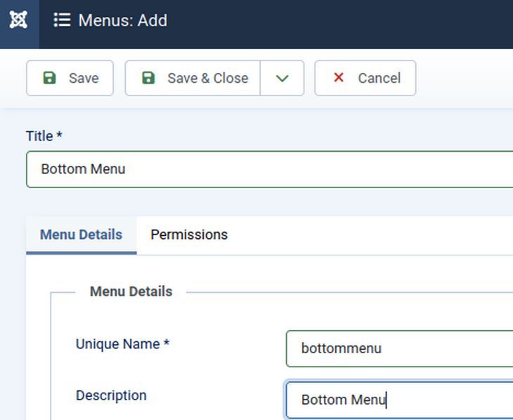
Give the new menu a title, a unique name and a description. Then click Save and Close. Then in the right side of the Bottom Menu row, click Add Module. Name the module Bottom Menu. Hide the title and assign it to the News 1 footer module position. Leave the menu unpublished. Assign the module to all pages. Click the Advanced Tab and set the Layout for dropdown-metismenu and the Module Tag for nav. Then save and close the Bottom Menu module.
Create a few new articles such as an About Us page and an Advertise with Us page. Then go to Menus, Bottom Menu and create menu items for these articles.
Now we need a Menu Module extension to help us set up the appearance of our new menu. This is a simple module that will allow us to create and style one or more new menus on any page.
https://extensions.joomla.org/extension/structure-a-navigation/menu-systems/ext-menu-reloaded/
Here is the download page:
https://github.com/Jefferson49/Joomla_module_ext_menu_reloaded/releases
Download the module and install it by going to System, Install, Extensions. Once installed, go to Content, Site Modules and open the Ext Menu Reloaded module. Change the name from Ext Menu Reloaded to Community News Links and place it in the News 1 footer position. And assign the Bottom Menu to this module. Below we added a Module Class Suffix of fullsquareblue.
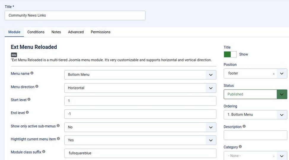
Click the Conditions tab and assign it to all pages. Then click Save and close and view the result.
Unfortunately, the module title does not display in the footer. The reason no module titles display in the Cassiopeia footer module row is that near the end of the cassiopeia index.php file, in the footer module row, is the following line which ends in style none:
<jdoc:include type="modules" name="footer" style="none" />
Meanwhile, all of the module rows that do display the title (for example, bottom-b) have this line which ends in style card:
<jdoc:include type="modules" name="bottom-b" style="card" />
So, go to Templates, Code and click on the child template to edit it. Then click on the index.php file and scroll down to the footer area to change footer style from none to card. Click Save and Close. Then view the result:

Step 15 Keep Cassiopeia main menu from collapsing into hamburger menu
To prevent the Cassiopeia main menu from collapsing into a hamburger menu on smaller screens, we need to go to Content, Site Modules and open the main menu module. Then click on the Advanced tab and in the Layout box, choose the "Dropdown-metismenu" option instead of "Collapsible Dropdown." Then click Save and Close. The word collapse means that it will trigger the hamburger to appear to early. By contrast, the simple Dropdown option will display the menu items vertically on mobile devices without collapsing it into a hamburger icon. As we narrow the screen width, the main menu collapses into a Hamburger menu at 992 pixels. We would like to continue displaying the main menu to a smaller screen. Add the following to our user.css file:
@media (width >= 692px) {
.metismenu.mod-menu {display: flex;}
.container-header .mod-menu {flex-direction: row; flex: 1; }}
Step 16 Remove the Government Topic Category
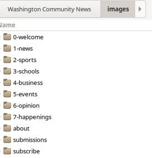
As the main menu continues to display on narrow screens, it becomes obvious that there are too many categories in the top menu. We will therefore eliminate the Government Topic Category and its sub categories from the Main Menu and simply include government news and election news as part of our Community News topics. This also includes removing the Government category and sub categories from our Content, Categories Table. Before we can delete a Category, we need to delete any articles we have placed in this category and then renumber the remaining Topic categories. We should also delete the government folders from our website images folder and from our Home Computer Article categories and Images categories and renumber the remaining folders.
Step 17 Customize the Topic Category Main Page Headings
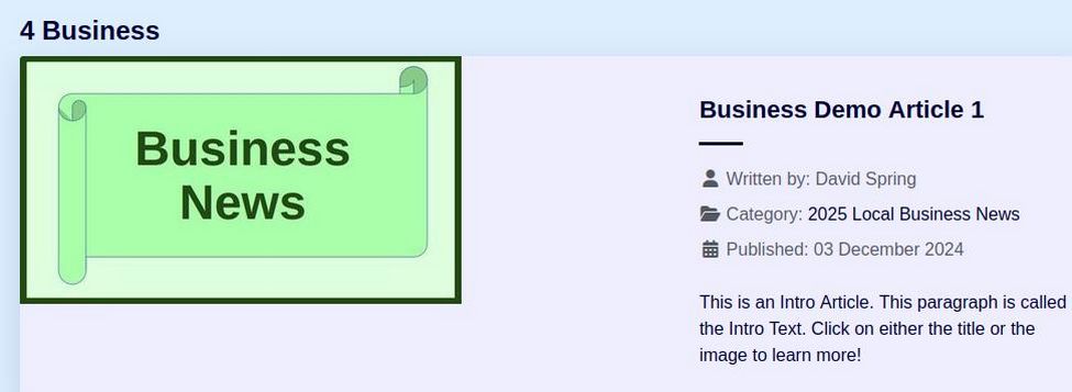
If you go to any top level Topic Category page, you will see that by default, it includes its category number:
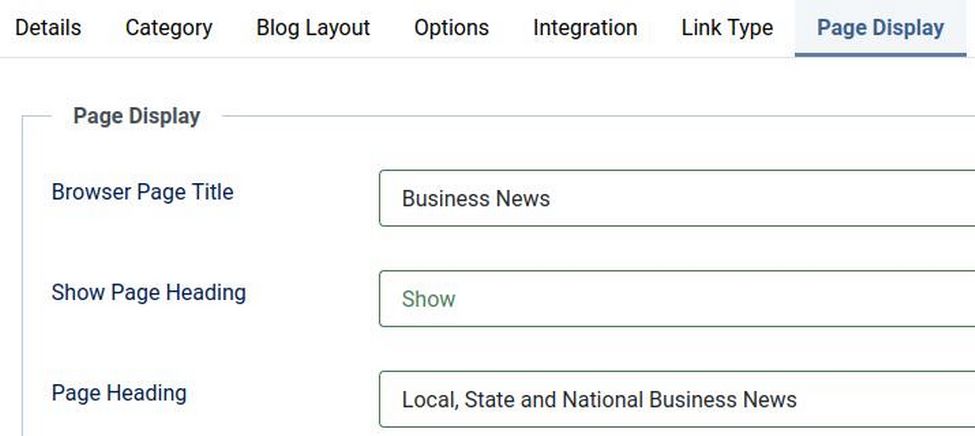
We can customize the title of the Topic Category pages by editing its menu item. Click the Page Display tab and type in the title you want to appear in the browser tab and the Page Heading:
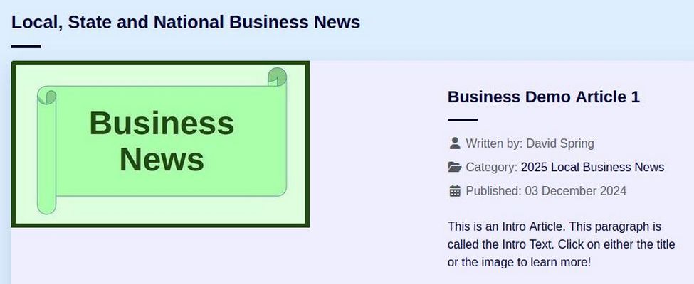
Then go to the Menu Item Category tab and hide the category name. Save and close the menu item and view the result:
Repeat for all Top 7 Level categories.
Step 18 Prevent News Topic Modules from Collapsing into 2 columns
By default, the Cassiopeia template collapses our three News Topic modues into two columns at a screen width of about 1100 pixels. Using the browser CSS inspector, we learn that this collapse is caused by the following default CSS:
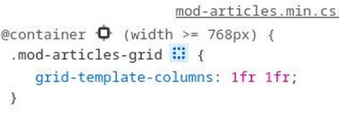
1fr 1fr means to collapse the page layout into two columns at any screen width above 768 px and below the next breakpoint which occurs at 1200px.
The solution to this problem is to add a third column to the CSS by adding the following to our user.css file.
@container (width >= 768px) {
.mod-articles-grid { grid-template-columns: 1fr 1fr 1fr; }}
Step 19 Reduce Margins and Padding of modules displayed on our News website Home page as much as possible
Every pixel of space on our Home Page is very important. Padding refers to space between or content (words and images) and the module box they are in. Margins refer to the spaced between modules or boxes of content. We can use our web browser inspector to seek out and remove unnecessary margins and padding. For example, change ul to:
ul {margin-bottom: .1rem;}
What’s Next?
This concludes our customization of the News 1 Child Template Page Layout. In the next series of articles, we will review how to combine Reader Comments and Author Submissions with the Joomla User Group and Access Levels.
