6 News Feature Boxes

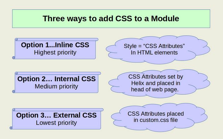
We are ready to review how to create and style custom feature boxes. In contrast to articles, which take up the entire web page, feature boxes, which Joomla calls modules, are small boxes of content which take up a small portion of a page defined by a module position. Each feature box contains a title, text, image and or video with a READ MORE link that typically leads the reader to a full article page with more information about the topic or product. We will first explain how to make a simple module with only some text and a title. We will then review how to style this simple module to improve its appearance using basic inline commands, internal styles and external style sheets. Next, we will learn how to use modules classes to more rapidly and consistently control the appearance of a series of modules. Then we will review how to combine border, background and link classes together to create complete module class presets. Finally, we will use our Rainbow module class presets to quickly create custom feature boxes. This chapter includes the following four sections:

6.1 Style Custom Modules with Inline CSS

6.2 Style Custom Modules with Internal and External CSS

6.3 Use Preset Classes to Style Custom Modules

6.4 Use our Rainbow Presets to Style Custom Modules

6.4 Use Rainbow Presets to Style Custom Modules

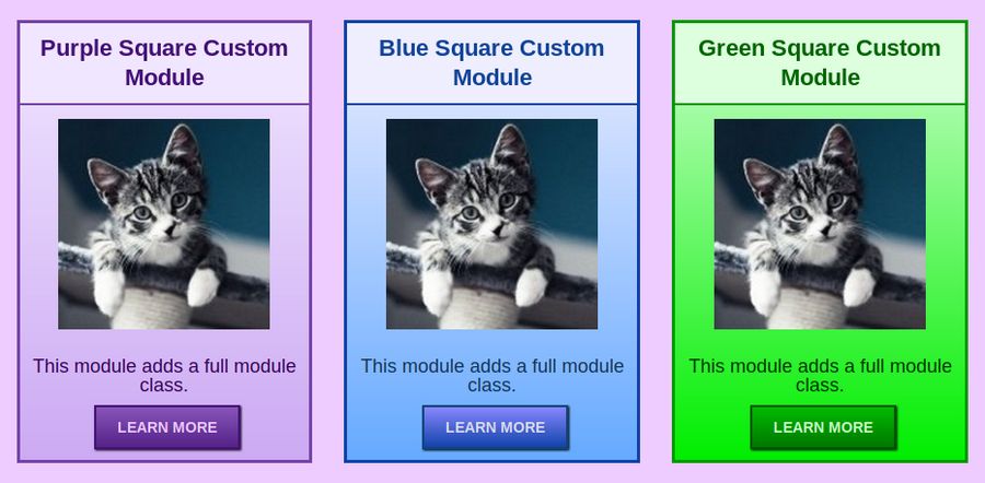
In this article, we will explain how we created our 24 Rainbow Module Presets. The Rainbow Module Presets include 12 vertical module layouts – intended to be used with 3 boxes per row - and 12 side by side module layouts intended to be used one or two boxes per row. Here is an example of our Rainbow vertical layouts:

01

Here is an example of our side by side module layout:

02

Both the vertical and side by side layouts come in 6 different colors with round buttons and 6 colors with square buttons.

03

In this article, we will review how we created these 24 CSS Presets, how to use them and how you can customize them even further.

6.3 Use Preset Classes to Style Custom Modules

Joomla offers us the ability to use CSS styles to change the style of groups of modules with module classes. In fact, module classes are the main way that professional template designers control the appearance of modules in their templates. They create beautiful module classes and then have their customers type in these module class names to give their modules a distinctive appearance. In this article, we will create our own custom module class and then apply it to one or more of our custom modules.

Apply a simple background color class to a custom module
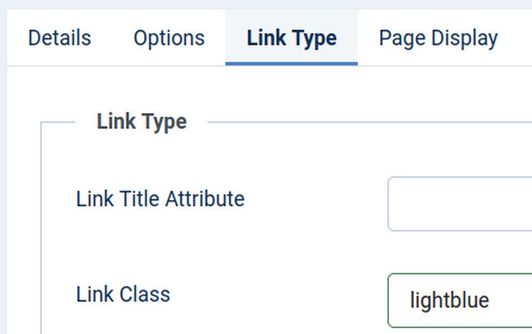
We have already seen how classes can be used to change the background color of a menu item. Recall that we placed classes such as .lightblue {background-color: #eeeeff; font-weight: bold;} in the Helix Template Custom CSS file. Then for any menu item we wanted to have a light blue background, we simply typed in lightblue (without the leading dot) in the menu item Link Class box.
01

We can use this style on as many menu items as we want and on as many menus as we want. Here is what this light blue class looks like on the front end Main Menu:

02

The reason the bold part does not appear is because our custom.css is being over-ridden by the Helix Typography Internal CSS. Right click on the Page Source to see this:

<style>.sp-megamenu-parent > li > a, .sp-megamenu-parent > li > span, .sp-megamenu-parent .sp-dropdown li.sp-menu-item > a{font-family: 'Arimo', sans-serif; font-size: 18px; font-weight: 400; text-decoration: none;}</style>

To allow us to control the appearance of individual menu items, we should first go to Templates, Styles, Helix, Typography and turn off the Helix Navigation typography. Unfortunately, this makes our font size for all of our menu items very small:

6.2 Style Custom Modules with Internal and External CSS

In the last article, we styled a feature box title and description with inline CSS using the JCE Editor. In this article, we will use Helix to style a feature box title and description using Internal CSS. We will then use External CSS to style a feature box.

01

Style a Module Title and Description with Helix and Internal CSS
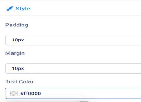
Go to Templates, Styles and click on the Helix template. Click Layout, Top Row 1 Edit. Then click Style. Change the text color to red (#ff0000).

02

Then click Apply. Then click Typography. Heading 3. Change the text color to purple and the font size to 22.

6.1 Style Custom Modules with Inline CSS

Feature boxes are boxes shown on the Home page of your website with a title, a short description, a link to a full web page (and optionally an image). Here is an example of a row of feature boxes.

01

Feature boxes are used to direct your website visitors to special pages on your website. Feature boxes can be placed above or below the main content area of your Home page. There are often two to four feature boxes on a row with typically one to two rows above the main content area and two or more rows of boxes below the main content.

One glaring problem of the Helix template (and Joomla in general) is the difficulty of controlling the appearance of feature boxes (which Joomla calls “modules” and Bootstrap refers to as “cards”). There are a couple of “extensions” and “content construction kits” which attempt to solve this problem. But they simply add another layer of complexity and another set of CSS classes that can make controlling the appearance of your feature boxes even more difficult. Therefore, we will first review the native way that Joomla handles feature box content and appearance. We will then add a simple series of custom CSS classes that can help you quickly and easily control the appearance of your feature boxes.